


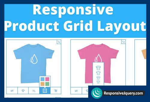
A responsive product grid layout that comes with some UI details for inspiration. The product will rotate showing the backside of the item when the rotate button is clicked.
Some examples of how tooltips can appear on hover or click are also included. Media queries can be used to resize the items in the grid or change the number of items in a row. Flexbox is used when supported.