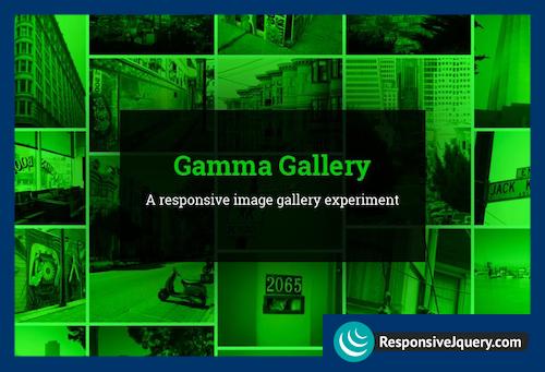
Gamma Gallery is an experimental responsive image gallery that attempts to provide an adjustable responsive images approach taking its grid layout and the full slideshow view into account.
Creating a truly responsive image gallery can be a very tricky and difficult thing. There are so many factors to consider like the layout and the features, and so many choices to make when it comes to delivering a good viewing experience for every device. Gamma Gallery is an attempt to create an image gallery that uses a similar responsive images approach to the proposed picture element. Focused on providing suitable image sizes for both, the fluid grid thumbnails and the full image view, the selection of images also depends on container dimensions and not solely on the window size. In some cases it might even be reasonable to load larger thumbnails for a smaller device if we, for example want to show less columns in a grid. So, smaller windows don’t necessarily mean smaller thumbnails.
Gamma Gallery uses David David DeSandro’s Masonry in a fluid mode where column numbers are defined depending on the grid container sizes.
Posted inGallery
A Responsive Image Gallery Experiment

A Responsive Image Gallery Experiment
